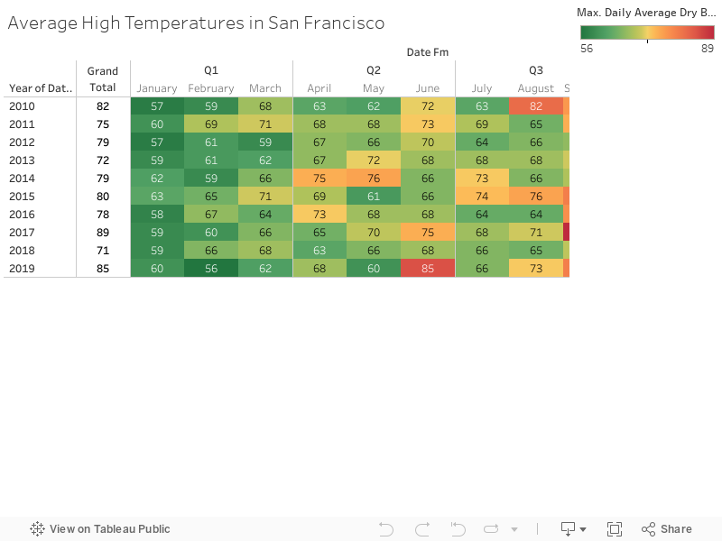
Tableau Visualation of SF Temps
This is a simple visualization showing the Average High Temperatures in San Francsico over the last 10 years. I was hoping for more years of data...but the source didn't have as much as I wanted. I was also hoping to show more trends about what I expected to be warming over the years. That is not too evident from this. Nontheless it was interesting to see that September/October were the warmest months--no surprise. And that June/July are NOT the coldest months--which is a vbit of a surprise.